Last month, I sent in a Project Life page print order to both Becky Higgins and Persnickety Prints. Because I wanted to be able to compare the prints to each other, I had the exact same pages printed in the exact same way. Here, I want to explain what the sites had in common and how they differed in the hopes that it might help you when you produce and order your own PL prints.
**This is an unsolicited and uncompensated evaluation of the print processing from these two sites. I'm simply sharing my personal experience and opinion so that others might consider this information when you get ready to print your own PL pages.
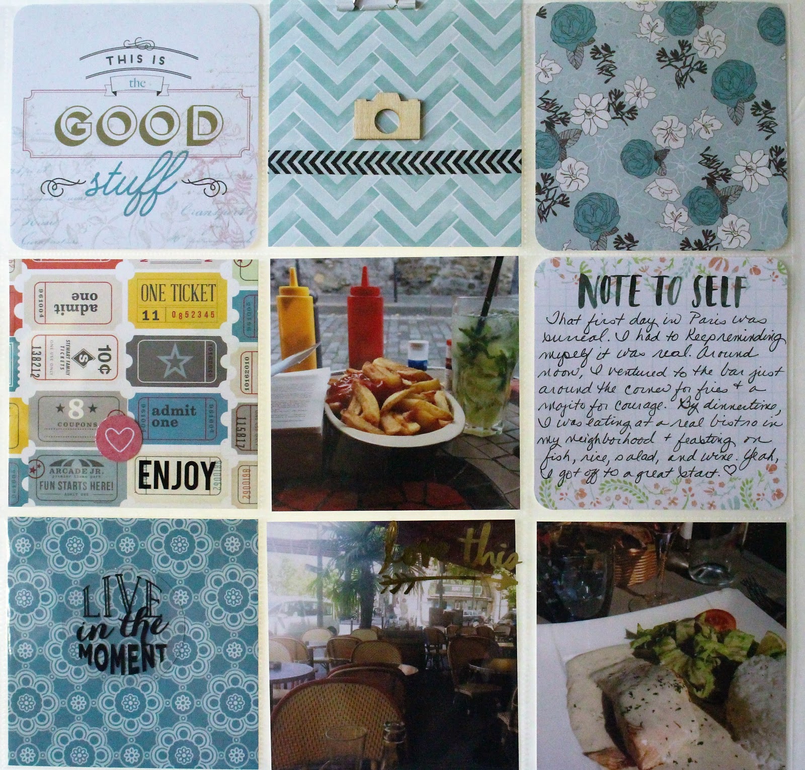
For reference, here are the pages I had printed. I'm not scanning and posting the actual prints as part of this post because the differences I noticed were not significant enough to show up in a digital scan. The only way you can really tell a difference between them was in person. And it was a total accident that I printed the same design style for each of the two pages; I didn't plan that at all.
Notice that I chose one page with a white background and one with a black background because I wanted to see how I liked having multiple style backgrounds in printed form.
How the printing process from Becky Higgins and Persnickety Prints were the same:
1. Both charged $1.99 per 12 x 12 print
2. Both offered the print in either glossy or matte
3. I ordered them within 5 minutes of each other and both arrived at my home in KY 9 days later
4. Shipping from both sites was a flat $5 fee
5. Both were printed on high-quality photo paper
6. Both sites updated me when my prints were ready to ship and offered tracking of my prints
7. Both sites offer print sales occasionally - 25% off seems to be the norm
8. Both sets of prints arrived safely without any kind of damage and were wrapped in waterproof casing during mailing
What I preferred about the processing at Becky Higgins:
1. The border of the black or white background was a tiny bit thicker from BH
2. The colors of some outdoor photos seemed a bit more saturated from BH (but this also made them seem a bit darker)
3. There were no extra steps to upload and print the pages since I created them using the BH PL app
What I preferred about the processing at Persnickety Prints:
1. The photo paper seemed a bit sturdier and heavier from PP
2. The colors on the prints from PP seemed a touch more vibrant, bright, and true-to-life
3. The matte finish was more matte from PP
4. The heavy cardboard included in the packaging made these prints feel safer during shipping
What I wish were different about printing PL pages:
1. Wouldn't it be great if you could print your PL pages from BH or PP on cardstock or linen or a more textured kind of photo paper? I still think this photo paper was a bit slicker than I would have liked for the whole layout. I'm guessing that's something that just takes getting used to though.
2. The turnaround time for printing was longer than I would have liked. Waiting nine days for my prints felt like FOREVER... Given that and the flat rate shipping cost, it's much wiser and more economical to prep several pages and print them all at once rather than ordering piecemeal like I did for this sample.
3. Since printing multiple pages will be rather expensive at $1.99 per page, that means I'll need to set aside some budget to do large print orders. If I have a large project, like an annual PL album or a huge trip to document, I'd likely need to print 15 pages or so at once to make it budget-friendly. It would be nice if these companies offered a bulk print price for a project like that rather than having to divvy up the printing for my budget needs. (PP offers the chance to buy print credits when they have a sale, so that's the next best option to the bulk pricing idea.)
The verdict:
I think you'll be happy using either of the printing services I tried, Becky Higgins or Persnickety Prints. I will probably mostly use PP in the future because I prefer their paper weight and the look of their matte paper over that of the BH site. Whichever printing service you choose, I think using a single printing service for a given project is wise because it will provide the most cohesive look for the project.
Showing posts with label Project Life. Show all posts
Monday, October 16, 2017
Wednesday, September 27, 2017
Checking in with more PL Europe Pages
Check out a few more pages about my Europe 2017 trip that I made this week using the Project Life app. All of these pages are about the time I spent in Prague.
On this page, I went ahead and included both a title and my journaling in the app. I'll probably add some embellishments in the lower right hand section when the print of my page arrives, but I actually think it's pretty finished otherwise.
I'm still undecided about whether or not I'll add a second page to this spread about my apartment in Prague. I have more photos that I could use, so I may ultimately make this one a two-pager. Notice that I left the title box empty because I want to use letter stickers or some other kind of title item for dimension. I did go ahead and type my journaling in the space provided, though, because I had a lot of information to share.
This is a two page spread that I made about taking a river cruise in Prague. The first page is the left hand side of the spread. I included the premade title card because I like the brightness of it, but I left the journaling card blank for me to add my handwriting as a personal touch.
I added a second journaling card to the right hand side of this spread because I have a story to tell about something that happened on the river cruise. That way, I can talk about the cruise generally on the left in the space provided and tell the specific story on the right side. This layout feels a little bit plain right now, but I think the added journaling and a few embellishments within the sky portion of some photos will perk up the feel of it once I'm finished.
I think I'm really liking using the different background color as a cohesive element for the different cities I visited this summer. As I work through other cities and explore other background colors, I'll decide if I like this approach or if I want to return to just a white background.
Have you given the PL app a try yet? I'd love to hear about your experiences and tips if you have. (Oh, and as a point of reference, I'm not receiving any kind of compensation from PL or Becky Higgins for using it; I just wanted to try it for my own scrapbooking.)
Peace out!
Wednesday, September 13, 2017
More Project Life pages from Europe 2017
I initially shared some of my Project Life pages from my Europe 2017 trip with you last week, and I thought I'd check back in this week by sharing a few more of those with you. Notice that I've left some blank spaces on purpose because I want to incorporate some traditional scrapbooking elements on each page. I also want to use my own handwriting on some of these pages, so I've left space to do that as well. I'm not sure yet if I'll write directly on the background space provided or if I'll adhere some subtle patterned paper with my handwriting on it. I am looking forward to playing with that when I get the pages printed. I just placed my first print order for my PL pages, so look for an upcoming blog entry in the near future where I compare/contrast the prints from Persnickety Prints and from the PL app itself. I'm excited to get those prints and play with the pages some to finish up their final versions.
For now, you can see where I'm starting for a few pages that I made from the portion of the trip I spent with students. Note that all of these pages have a white background for trim because I want to differentiate between my solo trip and my student trip for summer 2017.
After airing a ScrapGals podcast episode where I discussed my experience with the PL app last week, several listeners shared with me information that I had not known when I began using it. For example, it's possible to use other kinds of cards/titles within the app if you import them using another program. I definitely plan to play around with some of these options that will give me more variety in my pages, but, for now, I'm sticking with what I have already purchased through the app and already know how to use.
Wednesday, September 6, 2017
Playing with the Project Life app
In light of this week's podcast, I thought some of you might like to see some of the PL pages I've started making about this year's trip to Europe.
This page will likely be the first page in my album because it features my student group as we prepared to fly to Europe on June 1st. I may add some embellishments to the page once it's printed, but I feel good about what I've shared here in case I decide not to do anything else to it.

And here's a page I made featuring Schloss Charlottenburg in Berlin, Germany. Notice that this page is trimmed in a black background for now. My plan at this point is to use a different background color for each city OR to use one background for my solo travels and one for my student group travels. I can't be sure how I'll feel about that until I have some pages printed, but that's my thought process on the approach at this point. I've included some typed journaling and a title card, but I still plan to embellish this page a bit.


And here's the right-hand side of the spread. Notice that I've left some blank spaces purposefully because I want to create a title card and some embellishment clusters on these pages. The biggest challenge I faced in this spread is that many of the photos I took really need to have full 4 X 6 horizontal spaces to showcase the artwork. I wanted to include many pics of the art, so I chose to incorporate a 4 X 4 divided page, but that meant that I was only able to capture key portions of the art. I reserve the right to add additional pages from this experience if I think I need it. :)

And here's another two-page spread that I created about visiting the DDR Museum in Berlin. Again, I've left some blank spaces because I want to incorporate some of my handwriting into the album and because I want to add some embellishments here. I also couldn't find a title card that I thought really worked with this spread, so I'll probably make one using letter stickers. The tones of these photos are perfect to use with some October Afternoon vintage themed supplies, so I look forward to getting to use some of those here. This is the left-hand side of the spread.

And this is the right-hand side of the spread. There was so much to see in the DDR Museum that I may have to add either a smaller sized spread between them or add another page. I'm reserving that as a possibility right now.

There are some things I really like about the PL app. It's convenient since I always have my phone with me anyway; the resulting pages are very clean and crisp looking; it's ultimately cost-effective since you can use the initial investment of the various cards over and over again. I think it would be the perfect thing to use for gift albums for family and friends for that reason. My reservations come primarily from user error issues probably. I've struggled to "get to" the photos I want to use as I'm creating a page because I have like 8k photos saved to my phone right now. (They're backed up too, but I haven't cleaned up my library like I should.) I also worry that some of the pre-printed titles and messages don't really fit my life or experiences. And I've been reluctant to totally jump into this because I don't want to stop creating more tactile pages. I'm also kind of nervous about the weight and quality of printing the pages, but that's something I'm going to try this week and report back to you. For now, I like the ability to create pages quickly that I'm proud of and that document my stories. And leaving blank spaces for embellishments and texture feels like a happy middle-ground between digital and the old-fashioned way of scrapbooking.
Stay tuned for more pages and probably some aha moments in the future as I continue to work through my summer 2017 photos in this way!
This page will likely be the first page in my album because it features my student group as we prepared to fly to Europe on June 1st. I may add some embellishments to the page once it's printed, but I feel good about what I've shared here in case I decide not to do anything else to it.
And here's a page I made featuring Schloss Charlottenburg in Berlin, Germany. Notice that this page is trimmed in a black background for now. My plan at this point is to use a different background color for each city OR to use one background for my solo travels and one for my student group travels. I can't be sure how I'll feel about that until I have some pages printed, but that's my thought process on the approach at this point. I've included some typed journaling and a title card, but I still plan to embellish this page a bit.
Here's an example of a double page layout that I made about visiting the East Side Art Gallery in Berlin. It was one of my very favorite things I did the entire trip, so I may need more pages about it. These, at least, are a beginning. Here's the left hand side of the spread.
And here's the right-hand side of the spread. Notice that I've left some blank spaces purposefully because I want to create a title card and some embellishment clusters on these pages. The biggest challenge I faced in this spread is that many of the photos I took really need to have full 4 X 6 horizontal spaces to showcase the artwork. I wanted to include many pics of the art, so I chose to incorporate a 4 X 4 divided page, but that meant that I was only able to capture key portions of the art. I reserve the right to add additional pages from this experience if I think I need it. :)
And here's another two-page spread that I created about visiting the DDR Museum in Berlin. Again, I've left some blank spaces because I want to incorporate some of my handwriting into the album and because I want to add some embellishments here. I also couldn't find a title card that I thought really worked with this spread, so I'll probably make one using letter stickers. The tones of these photos are perfect to use with some October Afternoon vintage themed supplies, so I look forward to getting to use some of those here. This is the left-hand side of the spread.
And this is the right-hand side of the spread. There was so much to see in the DDR Museum that I may have to add either a smaller sized spread between them or add another page. I'm reserving that as a possibility right now.
There are some things I really like about the PL app. It's convenient since I always have my phone with me anyway; the resulting pages are very clean and crisp looking; it's ultimately cost-effective since you can use the initial investment of the various cards over and over again. I think it would be the perfect thing to use for gift albums for family and friends for that reason. My reservations come primarily from user error issues probably. I've struggled to "get to" the photos I want to use as I'm creating a page because I have like 8k photos saved to my phone right now. (They're backed up too, but I haven't cleaned up my library like I should.) I also worry that some of the pre-printed titles and messages don't really fit my life or experiences. And I've been reluctant to totally jump into this because I don't want to stop creating more tactile pages. I'm also kind of nervous about the weight and quality of printing the pages, but that's something I'm going to try this week and report back to you. For now, I like the ability to create pages quickly that I'm proud of and that document my stories. And leaving blank spaces for embellishments and texture feels like a happy middle-ground between digital and the old-fashioned way of scrapbooking.
Stay tuned for more pages and probably some aha moments in the future as I continue to work through my summer 2017 photos in this way!
Friday, June 17, 2016
Sharing a layout - Paris Pocket Page
I know some of y'all like to read the journaling. :)
Here are a few closeup shots of embellishments.
And here's one more look at the finished layout - I had a great time making it. This kind of page reminds me that I actually DO like pocket page scrapbooking when all of the slots are the same size.
Friday, May 13, 2016
Sharing a layout - 4 Paris Pocket Pages
Today, I thought I'd share with you the four Paris pocket pages I made a couple of weeks ago. I really want to get busy on this Paris album and finish it before I head out of the country again this summer. I spent about an hour and a half working on these four pages, so I think that's a doable goal at that rate. Fingers crossed that I can keep up the momentum! This first page focuses on my flight and arrival in Paris, complete with pics on the airplane and at the airport.
Sorry that some of these first pics are a bit too warm; I'm still playing around with the photo editing options on my new laptop. These pics show a closeup of some of the journaling on this page.
Using these 4 X 4 cards was a lot of fun, but I also have incorporated just regular patterned paper that I've cut down to the right size. I also am purposefully mixing both rounded and squared off edges. No rules for this girl!
These next two pages are basically a double page spread (not that I ever really do that anymore) that focus on my neighborhood in Paris and some of the little things about staying in a foreign country.
Here's the left side of the spread.
And the right side of the spread. As you can see, I combined dreamy kind of watercolorish patterned paper with gold accents across both pages.
If you like to read the journaling, then here you go.
Close-ups of decorative/title cards...
More journaling
And here's the last page I worked on recently. It faces an 8.5 X 11 traditional layout, so this page will be a stand-alone item in the album. You can see that I stuck mainly with dreamy patterns and gold accents, but I also incorporated a bit more color in the red heart card because of the red hearts on the love wall where I posed for a selfie.
Card and embellishment close-ups
A journaling close-up
I had a lot of fun making these pages. I think I like the pocket page style, but I don't like the pocket page method of weekly or monthly pages. Hmm...something to think about going into my scrapbooking future. :)
Sorry that some of these first pics are a bit too warm; I'm still playing around with the photo editing options on my new laptop. These pics show a closeup of some of the journaling on this page.
Using these 4 X 4 cards was a lot of fun, but I also have incorporated just regular patterned paper that I've cut down to the right size. I also am purposefully mixing both rounded and squared off edges. No rules for this girl!
These next two pages are basically a double page spread (not that I ever really do that anymore) that focus on my neighborhood in Paris and some of the little things about staying in a foreign country.
Here's the left side of the spread.
And the right side of the spread. As you can see, I combined dreamy kind of watercolorish patterned paper with gold accents across both pages.
If you like to read the journaling, then here you go.
Close-ups of decorative/title cards...
More journaling
And here's the last page I worked on recently. It faces an 8.5 X 11 traditional layout, so this page will be a stand-alone item in the album. You can see that I stuck mainly with dreamy patterns and gold accents, but I also incorporated a bit more color in the red heart card because of the red hearts on the love wall where I posed for a selfie.
Card and embellishment close-ups
A journaling close-up
And here are all four pages one more time for your perusal, in the order as they appear in my Paris album.
I had a lot of fun making these pages. I think I like the pocket page style, but I don't like the pocket page method of weekly or monthly pages. Hmm...something to think about going into my scrapbooking future. :)
Monday, February 1, 2016
Creative Goals - The February 5
Five Creative Goals for February 2016
1. Schedule out blog posts for one month ahead - I'm tired of scrambling to get posts up at the last minute. I think I'll provide better content and have a more relaxed life if I can do a bit of planning ahead here.
2. Make a spring banner to hang somewhere in my house. Maybe the mantel? Maybe my studio? Maybe my bedroom?
3. Order a huge printing of 2015 photos - mainly from October through December. Does Snapfish have a coupon right now? Does Persnickety ever run a fabulous deal?
4. Make my 2015 Week in the Life mini-album.
5. Finish my Paris 2015 album projects.
Can I do it? I sure hope so. I figure keeping my list to just 5 goals was pretty reasonable. What are your goals for a creative February?
(My desk as I left it last night - not clean but manageable at least)
1. Schedule out blog posts for one month ahead - I'm tired of scrambling to get posts up at the last minute. I think I'll provide better content and have a more relaxed life if I can do a bit of planning ahead here.
2. Make a spring banner to hang somewhere in my house. Maybe the mantel? Maybe my studio? Maybe my bedroom?
3. Order a huge printing of 2015 photos - mainly from October through December. Does Snapfish have a coupon right now? Does Persnickety ever run a fabulous deal?
4. Make my 2015 Week in the Life mini-album.
5. Finish my Paris 2015 album projects.
Can I do it? I sure hope so. I figure keeping my list to just 5 goals was pretty reasonable. What are your goals for a creative February?
Saturday, April 4, 2015
5 Crafty Blogs
I know, I know, this is my own crafty blog. so why am I out here pimping out someone else's online presence? Quite simply because they are fabulous. I don't remember when/how I first got the idea to visit these blogs, but I found a handwritten, pencil list of a bunch of blog addresses in my school bag the other day. During some downtime one evening, I started pulling up these blogs and reading. Immediately, I was hooked on these five. Go check them out; you won't be disappointed! (Oh, and these people don't know I exist and haven't compensated me at all. I'm just sharing them because I think they're great.)
1.Chris and Paige
2. Nicole Reaves
3.Create, Share, Love
4. She Knits and Creates
5. Trisha Harrison
Each of these bloggers has a bit of a different voice and a different style, but I think they are all fresh and inspiring and fun. I hope you'll go take a look and spread some love!
1.Chris and Paige
2. Nicole Reaves
3.Create, Share, Love
4. She Knits and Creates
5. Trisha Harrison
Each of these bloggers has a bit of a different voice and a different style, but I think they are all fresh and inspiring and fun. I hope you'll go take a look and spread some love!
Friday, April 3, 2015
Happy mail
Last Sunday night as I played on the Internet minding my own business, I ran across a tidbit from Studio Calico about a last chance sale they were having. That was all it took. Within 10 minutes, I'd selected and paid for my choices; 48 hours later, happy mail was at my doorstep. Each Project Life kit was $10 on this sale, but shipping was pricey at $8. I'm not sure how much the monthly kits are normally, but I bought the December, January, and February versions. Still, I feel like I snagged a bargain. I have to admit I was a bit bummed when I first saw the size of the boxes. Once I got everything out of each kit and spread it out to take a look, I realized I'd actually gotten a ton of supplies for the price. See and drool. You have been warned. Lol!
I'm happy, happy, happy with my mail yumminess. Since I'm headed on vacay, I prob won't get a chance to play with them just yet. Rest assured, they'll be waiting for me when I get home. :)
Wednesday, November 12, 2014
December Daily - the almost finished edition 2013
My December Daily from 2013 is 95% finished. In fact, I could probably finish it in a single evening. Maybe sharing it with you here will encourage me to actually go through with it and finish it for reals. In that spirit, I thought I'd share with you what I've done on it so far. I'm so close to completing it; maybe this will be the impetus I need to actually put this baby to bed.
I chose a 6 X 8 Snap album for my DD last year. It really is a great size; I'd recommend it for anyone to use for this project. I don't think going any bigger is wise, but you might want to consider an even smaller album. As you can see, I haven't yet decorated the cover. My decorated cover from 2009 has sort of fallen apart and needs to be redone, so I'm reluctant to make changes to this cover. It's on my 5% to finish list. I went with the green and kraft combo because that is the green that most of the interior of my house is painted. I thought this album would look pretty on my coffee table or on a shelf on display because of that. Still, it's too plain as it is right now.
Here's a glimpse of the album from the side with it open.
Day 1 focuses on my Christmas tree. (There's a bit of a glare on a couple of pages because I'm taking these pics outside on my glass picnic table in an effort to catch the last of the natural light - sorry in advance.)
And on the other decorations around the house. I really need to journal on the back of the tree page, but I haven't gotten around to that yet.
Day 2 focuses on cooking for my girl each week. I popped up some elements and used some layering on this page which makes me happy.
The next day focuses on our football team winning the state championship for the third year in a row. I thought the repetition of 3 was a cool aspect of this page, plus I like that there's a lot of journaling. Note that the page on the right is smaller to create some variation in the album. I also used a picture collage on the right hand page which is something I haven't done in DD before now.
I didn't have anything Christmasy to say about days 4 and 5, so I included a page about the Big Bang Theory and about my obsession with taking selfies. Day 5 was also the first day that I used a divided page protector in the album.
On day 6, I included a variety of small photos in the page protector that focused on the weather and on my boy bestie having surgery. Day 7 was about the podcasts I listen to regularly. I thought it might be fun to glimpse back at that sometime in the future.
I chose to include a pic of Sergeant's dog, Lily for day 8 (she was spending a few days with me at the time) and a description of our pep rally that celebrated our state championship on day 9.
Day 10 features a shot of Kelsey and Jake's house and day 11 describes the very mundane task of going to the doctor before the end of the calendar year. I tucked the journaling behind the right hand page to keep it looking clean since there was a lot going on in this spread overall. Notice the scalloped edge on the right page as a repeated element.
I discussed a first date experience for day 12 and one of my friends on day 13. Note that the pic for day 13 was from the summer, but the actual story of the page was just about having dinner together the month of December.
On day 14, I shared the story of giving the ACT while day 15 focuses on a family pic I took of Kelsey and Jake. (The actual picture was taken at Thanksgiving, but I took it with the intention of it being a Christmas card photo, so, for me, it works here.)
On day 16, I included a pic of Kelsey's dog, Ollie, who often comes to my house for sleepovers. Day 17 was a small insert page that was a PL card on one side and journaling about our faculty potluck on the other side. I forgot to take pics of the potluck, but I wanted to tell the story in my album anyway.
This shot shows the journaling from day 17 and a pic of our downtown park lighted for the holidays for day 18.
The back of day 18 has more of our city lights/downtown area featured. Day 19 is a closeup of the ornaments on my tree with a journaling card tucked behind it. Day 19 is another smaller size page to create a little more variety in the album.
I'm not finished with day 20 or 21. I have the base page started for day 20 and the page protector to work with for day 21, but I haven't followed through on those days yet. Add that to my 5% that needs to be finished. (I'm keeping it real here...)
Day 22 is a two page spread that includes a divided page protector on the left and a smaller size insert page on the right. It focuses on our holiday gathering with my best friend's family at her house just before Christmas day.
Day 23 is the back of that small insert page and features a photo of me in front of my Christmas tree before I went to an event at church, I think. (I didn't write it down, so I don't remember 100%.) I like the lighting of this photo a lot.
Technically, I only need to include pages for days 24 and 25, and I'll be finished documenting my December Daily for 2013. In years past, I've gone all the way to New Year's Day, but I know most people probably only document through the 25th. My next step is to go back and finish days 20, 21, 24, and 25. Once I've done that, I could always continue through the end of the month if I really wanted. My final task will be to decorate the cover of my album.
I'm challenging myself to finish these few pages of DD before Thanksgiving this year. I think that's a doable goal and would allow me to focus on this year's DD at that point if I wanted. I'm still not convinced I want to make a traditional DD this year, but I hate to not play along with the project in some way. It's always so much fun, and I love seeing what other people are making during the month.
Later this week, I'll share more pics of other December Daily albums that are in various stages of completion. I hope you'll stay tuned. What are your plans for DD this year?
Subscribe to:
Posts (Atom)