
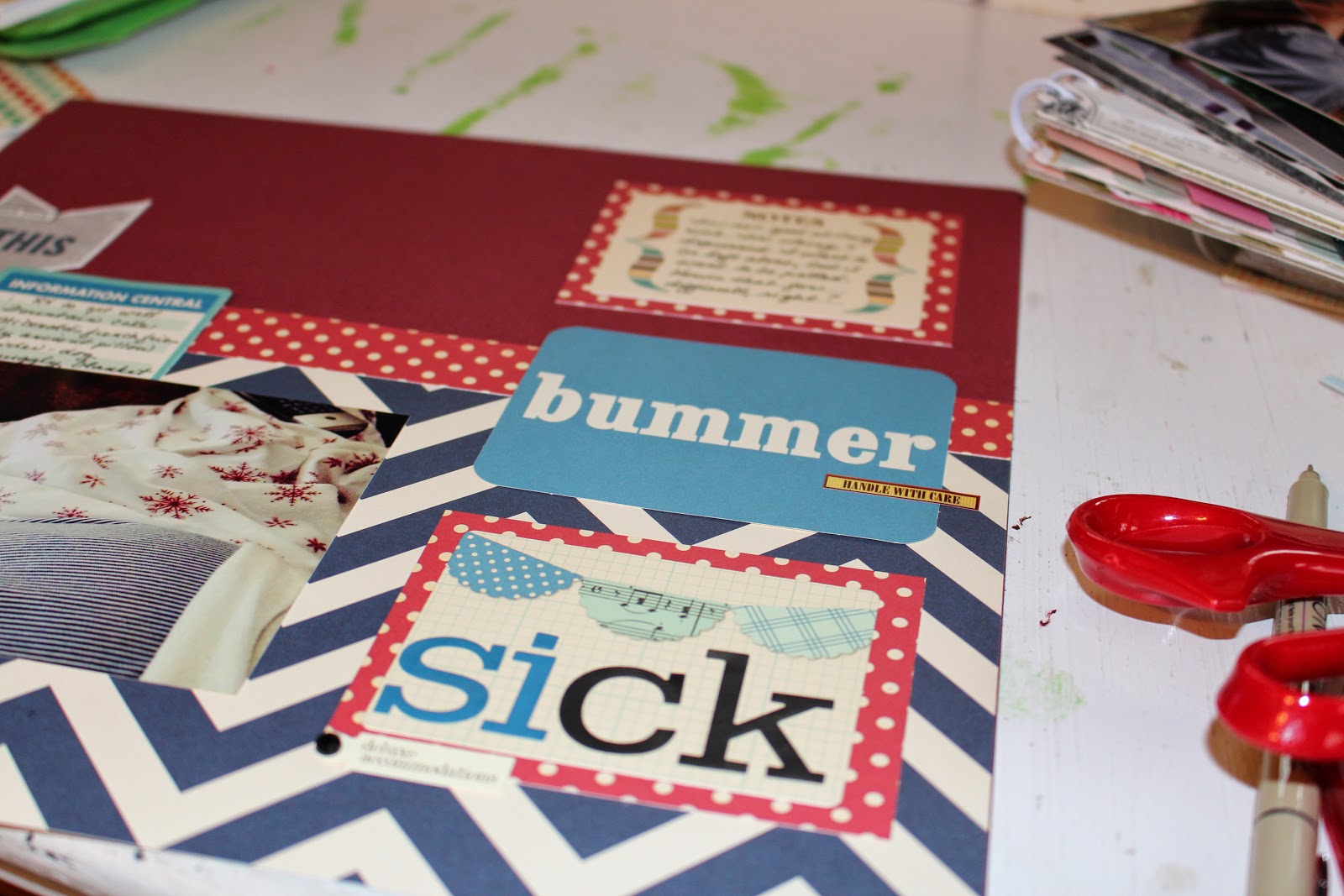
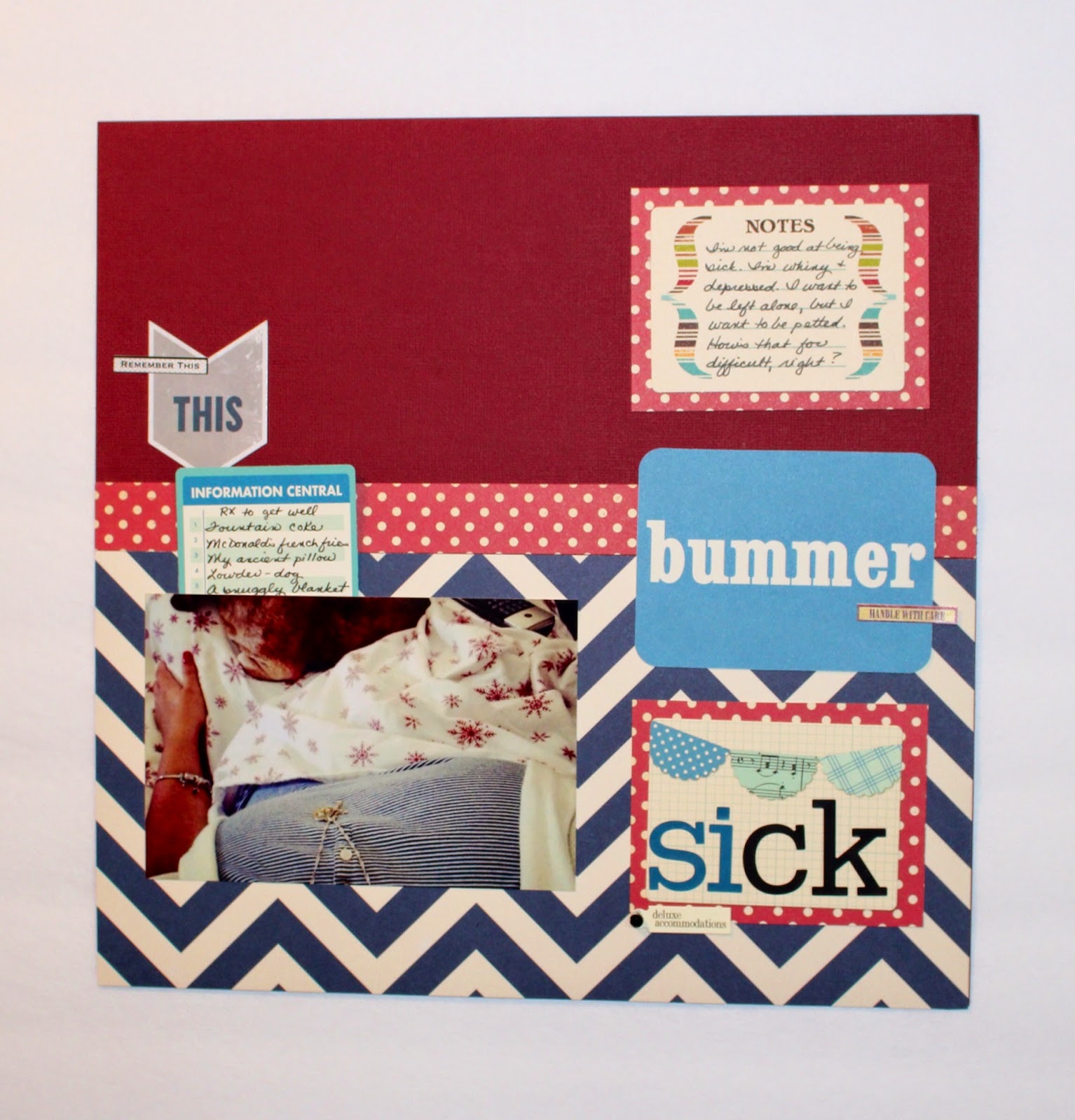
This is a layout that I've wanted to make since I was sick a couple of days last week. I ran across a pic I took of myself one day last summer when I was under the weather and thought it might be a fun tidbit of a story to share. I pulled papers and a few embellishments and left the stuff laying on my desk for several days. I was busy and still not feeling great, so I didn't push the layout right away.

My messy desk needs some attention, doesn't it? Oh well, another day...

I wanted to use that chevron paper, and it just so happened to match my nightshirt from that day. The brick red picks up the colors from my snowflake sheets in the pic. For some reason, I was drawn to an aqua with that combo; it's not a traditional color pairing, but I thought it felt kind of fresh.

This time around, I didn't use a sketch or an inspiration piece. Every now and then I just like to play around and see what happens. I like that this layout is a combination of different lines/products - the dot paper is old, the solid is cardstock, the chevron is October Afternoon as are the journaling cards. The chevron sticker is from Amy Tangerine's new product line and is a subtle nod to the chevron patterned paper at the bottom. I think it also draws attention to the journaling on that OA card.

Don't judge my RX to get well list - just keeping it real. I'm a bit spoiled, eh? :)

To maintain a feeling of balance, I have journaling on the left that peeks out from behind the photo and journaling on the top right. I try to adhere to the rule of the visual triangle in design, and I think repetition of elements like patterns and journaling help to accomplish that.

At first, I didn't mat the top and bottom PL style cards by OA, but they felt like they needed to be grounded somehow. By matting those cards in the same strip of dotted paper across the middle of the page, I achieved both grounding and repetition. The title letter stickers are American Crafts Roosevelt stickers. I didn't really want to mix the colors, but I didn't have enough to do the whole word in either color.

Notice that I used a 7Gypsies sticker on both the right and left hand side of the layout. I like the added touch that creates in terms of continuity. I also repeatedly let items hang off the edges of the cards a little bit - the 7Gypsies stickers, the ancient Making Memories tag, the OA card peeking out from the photo. For me, those are little touches that help make the layout a little more dynamic than if everything were lined up exactly to the edges.

I'm not sure which line the bummer PL card is from, but I thought that sort of summed up the whole idea of how miserable it is to be sick. I didn't round the other corners on the layout for a very practical reason; my corner rounder is broken. I think it works since the rounded element is in the middle of the page and isn't matted. Those things separate it from the other page elements and make the rounding look purposeful instead of accidental.
Here's the finished layout:
So cute. That's really great insight into who you are and I liked your layout process explanation!
ReplyDelete