

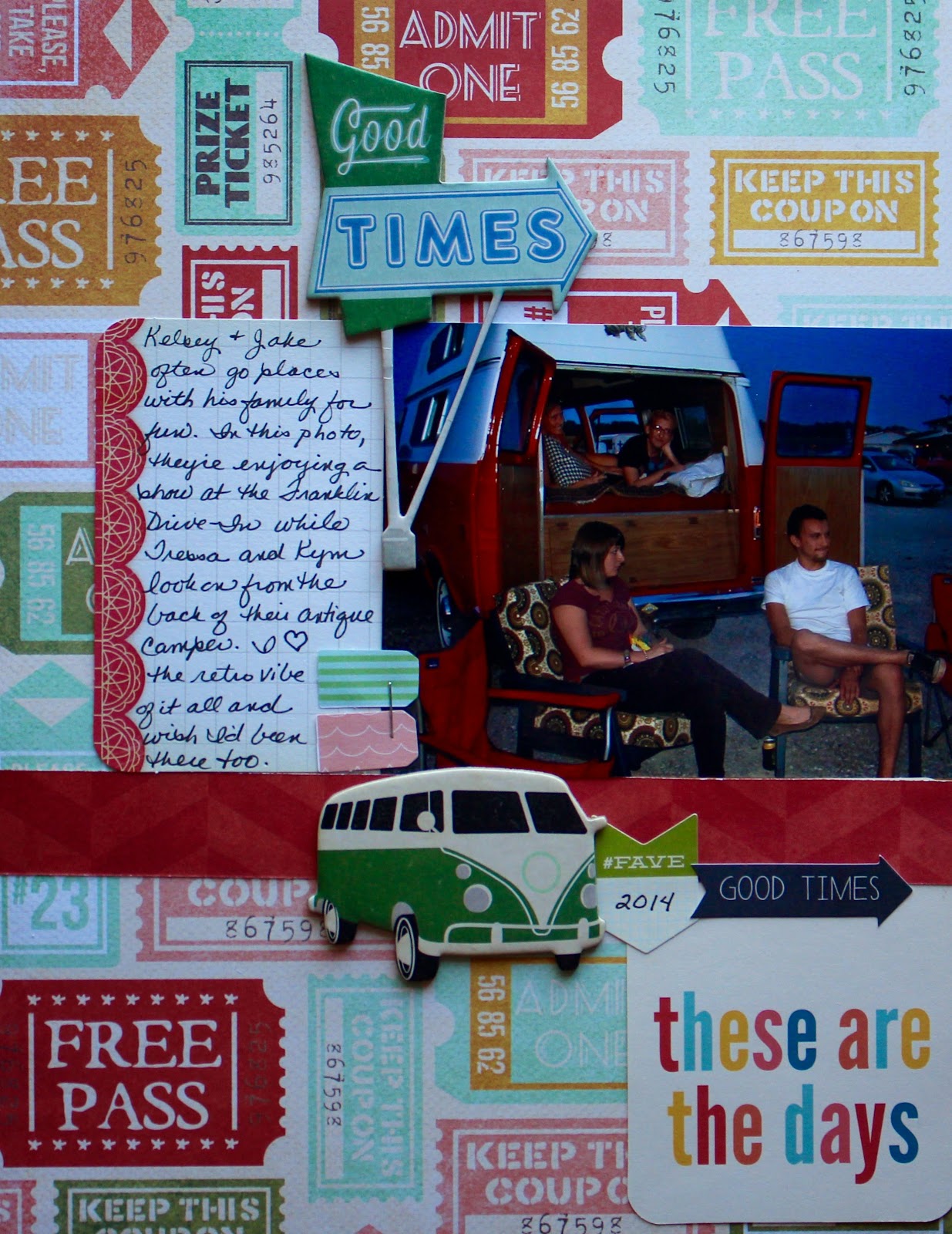
I started by cutting down my background paper (Crate Paper, I think) to 8.5 X 11 since I only had one photo for this layout. Since this page is about a trip to the drive-in, I thought the tickets as background made sense. After trimming the photo a bit to get rid of busy background items, I placed in on the page against a horizontal strip of the side B of the same paper. (That's a great tip if you aren't sure how to match papers/patterns. Just use the reverse of the paper you chose.) I added a PL card to the left of the photo, so I'd have a spot for journaling. After that, I layered a chipboard old-timey looking sign to capitalize on the vintage feel.

In this photo, you can see the title block at the bottom right hand side of the page. I know a lot of people like to always put their titles on the top left since that's how we read, but I like to mix things up a bit. I started by tucking a PL card underneath the strip of paper to ground it a bit and to reduce its overall size. Then, I layered some goodies on the left to up the fun factor - stapled a couple of tags to the side of the photo, parked a chipboard retro van at the corner of the photo, added a Jillibean Soup fave label with the date, and finished with an arrow sticker.
Here's a look at the finished layout. It makes me pretty happy. Isn't that what scrapbooking is supposed to do?
Did you work on anything crafty this past weekend? Was it fun?
I absolutely love this!! It's one of my faves of yours! Perfect!
ReplyDeleteGotta love the drive-in :) I need to go sometime. I recognise the Kraft PL card. I just spotted that exact one on my desk and put it with some photos to use. Thanks for sharing your layouts and stories with us.
ReplyDelete