

Here's a layout I made a few days ago about the Valentine's Day train trip that the fella and I took in 2015. I had several pictures I could have used, but I stuck with just two 4 X 6 pics because I thought they told the story fully enough. Maybe I'll use those other photos later on in some personality layouts or something.
Here's a look at the journaling that I wrote on a scalloped card I found in my stash. By the way, I like putting more sappy or personal journaling on a card that can be slipped behind something rather than being front and center for everyone to see. That way, a casual viewer of my album probably wouldn't take the time to pull out each card. Someone who really cares about me or my story would take that time. See what I mean?

I think the papers are some old Crate Paper line, but I really liked them because the colors were soft and rather un-Valentine'ish at first glance. Overall, though, I think the effect works with the holiday because I did include accents of red. At first, I wasn't sure if the red and pink and salmon colors would work together, but I think I've decided I like them. Here you can see the journaling card tucked behind the photo block and a cute little bow to draw attention to the focal point photo.

To balance out the right side of the layout, I stacked three older embellishments along the side. One was Crate Paper, I think, but the others were from a totally different line. I liked that they each still had that salmon color in them. I think the impression of the layout as a whole is ombre - basically, I'm using shades of red, pink, and salmon that would be like stairstep shades on a paint chip.

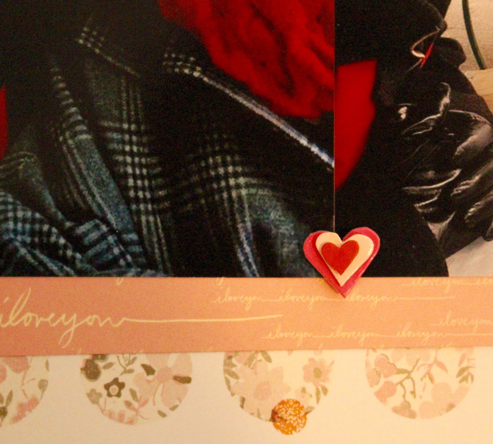
I repeated the heart icon at several points in the layout; I think repetitive elements help create a cohesive look.
And here's another look at the final layout. Do you have any Valentine's Day or romantic layouts planned to make soon?

This is lovely. I think you're right -- I think the colors work because they're in a color family -- all warm tones -- and other than the neutrals, it's relatively monochromatic. I'm glad you have a "keeper." :-)
ReplyDeleteI really like the effect that your paper choices have here - a very warm and romantic look to the page.
ReplyDelete