

I started by arranging the paper I loved into strips, because that's just how I roll.


Once I realized my plans weren't working, I went to Pinterest to look for some sketches. For this layout, I followed a sketch by Kristine Davidson.. Of course, I didn't do my layout exactly like the sketch, but it's pretty darn close. Here's the sketch:

I didn't go with a solid background but chose to stick with the paper strips I'd originally planned. I also played with the location of the photo strip and moved it much closer to the top of the page. This allowed me to work with larger photos, roughly 3.5 X 5 and to make my title and journaling block a bit larger than the original.

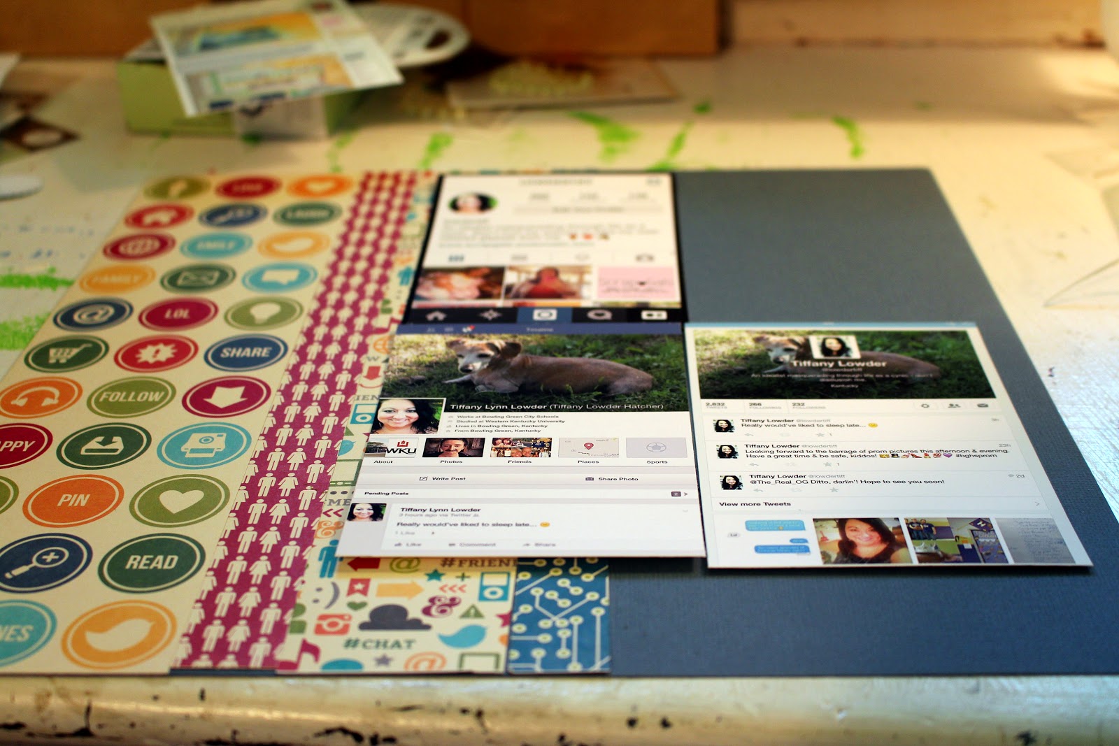
There's so much I could say about social media, but I thought I'd approach this page as an overview of that part of my life. I just took screenshots of my various accounts to use on this page. Some other time, I might do a page about what I like specifically about each site or about funny/interesting things I've said on that site in the past, but today was really just about pointing out how connected I am via social media. Plus, it gave me a great chance to use some of the new Jillibean Soup products. :)
I had so much fun creating this title block. I started with a Jenni Bowlin journaling card from a few years ago, added a title in Jillibean Soup stickers, layered the Amy Tangerine status sticker as a nod to media updates, and popped all of it up from a bit of brick red cardstock to ground it on the patterned paper that would be the background piece.

Rather than use a star embellishment to layer on my circle, I chose a couple of hearts and a thought bubble sticker. Remember that symbols like stars on a sketch aren't necessarily meant to be interpreted literally. I also decided to connect my journaling block to prevent trapped white space and to add to the purposeful vibe of the journaling placement. Floating the Jenni Bowlin shaped journaling sticker at the very bottom of the page just felt weird to me, so I moved it up a bit.

And the finished product -- I love the bright, happy colors and patterns, the linear, grid-style look, and the clean edges to the embellishment groupings. The products are fun and the design was different than I probably would've come up with on my own. I have a tendency to always stick to a visual triangle with embellishments/titles, so putting all that information on the bottom was a real departure for me. I think it works because the embellishments carry a similar visual weight as the picture strip does.

OMGosh!! I love, love, love, love, love, love, love, love, love, love, love, love this! I am totes going to scraplift you on this. Love!
ReplyDeleteI think I am going to scraplift this, too. This is amazing, Tiffany! Wow, you guys are really rolling out the layouts the more podcasts you do.
ReplyDelete