I've had this layout on my desk for a few days trying to figure out placement of journaling and embellishments, but I'm finally happy with how it turned out. Here's the finished layout - I took better pics today & updated the pics.

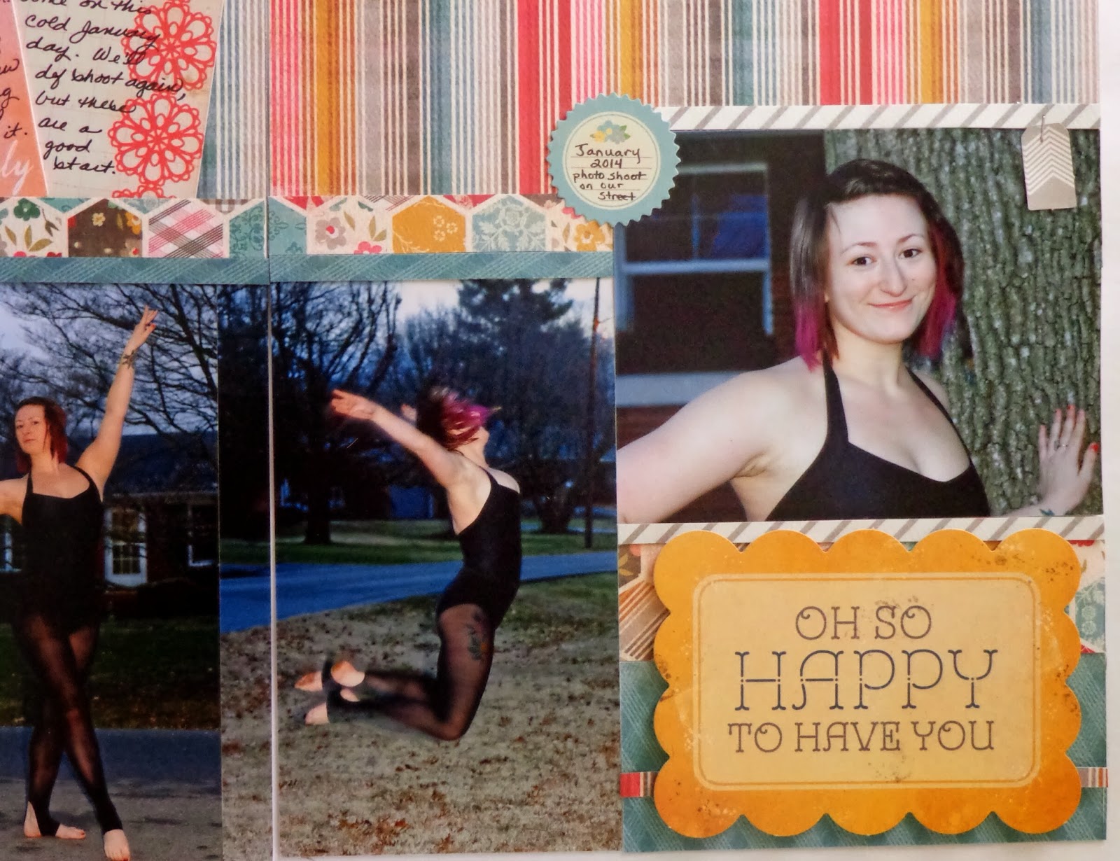
I ended up moving my focal point photo on the far right. Originally, it was in line with the others with the title below it. Once I realized I wanted to use that die cut title card, though, all bets were off. I moved the focal pic up, trimmed it with patterned paper as a kind of frame, and used the diecut in the larger space left below it.


Can I just say that I'm in love with paper diecut shapes/words and my tiny attacher? Oh, and I love my girl an awful lot too. :) Hope y'all are having a great Monday! The time change kicked my butt...so much so that I took a tiny nap after school today. (Being single and having no kids at home allows for things like spur of the moment naps. I'm spoiled, lol!) Even with the nap, I've managed to put homemade beef & veggie soup on for dinner and to finish this layout. And now I'm blogging? Woot! Woot! This girl is on fire tonight...well, at least there are some embers left. ;) Go and be crafty!

 I ended up moving my focal point photo on the far right. Originally, it was in line with the others with the title below it. Once I realized I wanted to use that die cut title card, though, all bets were off. I moved the focal pic up, trimmed it with patterned paper as a kind of frame, and used the diecut in the larger space left below it.


 Can I just say that I'm in love with paper diecut shapes/words and my tiny attacher? Oh, and I love my girl an awful lot too. :) Hope y'all are having a great Monday! The time change kicked my butt...so much so that I took a tiny nap after school today. (Being single and having no kids at home allows for things like spur of the moment naps. I'm spoiled, lol!) Even with the nap, I've managed to put homemade beef & veggie soup on for dinner and to finish this layout. And now I'm blogging? Woot! Woot! This girl is on fire tonight...well, at least there are some embers left. ;) Go and be crafty!
This is stunning! Great job!
ReplyDeleteLove it! The paper colors are great. Will you insert it in Project Life or another album?
DeleteThanks Tracie and Lisa! Lisa, I'll put it in my yearly album which is project life style primarily. I'll just put it between my January monthly spread with any other layouts I do or inserts I want to include that fit that time frame. :)
ReplyDeleteThis may be one of those layouts where I said, "What if the colors don't match your spread?" so I would love to see pics of that inserted into your album so people can see that you can just stick it all in one album!
ReplyDelete